Reactions, associations and perceptions – colours determine the environment and accompany our life.
Upheavals and change are always part of the passage of time. However, uncertainties and changes reflect the global situation more than ever. When the Pantone Institute announced its Colour of the Year “Very Peri” for 2022 at the end of December, the severity of current world events could not have been foreseen. However, it became clear that 2022 would be a year of ambivalence and change.

Complex and unorthodox
“Very Peri” is an inherently complex composition of blue and red. The colour is expected to determine new products, collections, trends in interior design, fashion and the furniture industry this year, in an interplay of calm consistency and powerful energy. Yet, this shade is not one of the most common used in architecture and interior design on a large scale. It is mostly used in small accents and combined with different materials. However, this in no way makes the colour less important. While individual coloured textiles and furniture are used in interiors, violet can be found in architecture in the form of façade elements, lighting and individual colour elements.


A touch of extravagance
Especially in combination with grey exposed concrete or shiny stainless steel, the colour looks elegant and timeless. Within such a colour spectrum, the colour’s blue component is emphasized, conveying a certain restraint and objectivity, but also a high degree of consistency. This simultaneously creates a subtle contrast, counteracting an exaggerated coolness in minimalistic room concepts. If the colour palette is expanded to include black or anthracite, rooms can change from a very classic appearance to a dynamic and exciting spatial impression.


Vibrant with all facets
If, on the other hand, the colour is arranged with warm wood elements, the reddish colour component comes to the fore and embodies intensity and vibrancy. A certain naturalness and playfulness become the focus, although an image of comfort with a nuance of exclusiveness is created. This demonstrates the variety of effects that can be achieved with this colour in the field of design and architecture, although its first, yet very special and extravagant impression, would not suggest this.


A hybrid – rarely uncontroversial
“All mixed colours are perceived as ambiguous, unobjective, uncertain.” This is Lisa Heller’s opinion in her well-known work How Colours Work. Understandable, if one considers that it always requires two partners as well as an exact mixing ratio, to bring about a certain colour nuance. In addition, the colour impression can change depending on the incidence of light. Violet, purple – or, as sometimes referred to as lilac – takes on a special role here. This has already shown the wide spectrum of very divergent perceptions and spatial impressions that can be evoked with this colour. Beyond that, violet is also perceived very differently by people, as a colour mixture itself. This is due to the fact that the colour rarely occurs in nature and can thus evoke very different associations – from aloof and dangerous to exceptional and creative. Using this colour requires very thoughtful engagement. However, this starting point also brings with it a great deal of spontaneity, as an entire spatial concept can be transformed by changing or adding just one parameter – the incidence of light, for example.

Envisioned anew and developed further
The introduction of the colour “Very Peri” marks the first time in the history of the Institutes’ annual definition of the year’s trend colour, that it has created an entirely new colour (PANTONE 17-3938) rather than relying on an existing hue. This approach stands for the fact that within the current society and the entire design world, it should be about thinking creatively beyond standards and developing further. An aspect that is also emphasized at SIMONSWERK. Passion for quality, design, aesthetics and the perfect detail, lead to numerous new surface variations in order to generate maximum design freedom.
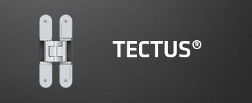
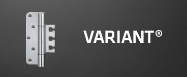
The TECTUS and VARIANT hinges in particular, enable the perfect fusion of classic accents and modern room concepts. This can be seen with the completely concealed TECTUS hinge in stainless steel that appears timeless and elegant next to the trend colour of 2022, while in black or matte black, it recedes almost invisibly in a room designed in dark purple, emphasizing a mystical spatial effect. The VARIANT heavy-duty hinges, especially those in bronze or rosé gold, bring the reddish colour component of “Very Peri” into focus. This gives every entrance and passageway setting and exclusive, warm and very inviting character. With high-quality, certified materials and diverse surface finishes, SIMONSWERK offers the possibility of designing rooms creatively, dynamically and boldly – quite in line with the complex, imaginative and lively trend colour of 2022 “Very Peri”.
Further information on the many different finishes of SIMONSWERK’s products can be found here.
Download article as PDF
The new article "Colours: Perceptions and meanings for creative design intent – beyond the construction industry" from our online magazine is available for you to download. Once downloaded, you can read the article offline anytime and anywhere


